
✨ Like what you see?
I'd love to bring your idea to life — just drop me a message with the details!
I'd love to bring your idea to life — just drop me a message with the details!
📩 Reach me at rulanabil@gmail.com
------------------------------------------------------

Project Title: Fresh Steak Sandwich Eatery – Brand Identity Development
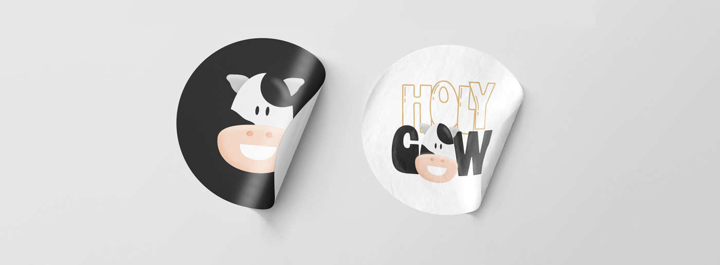
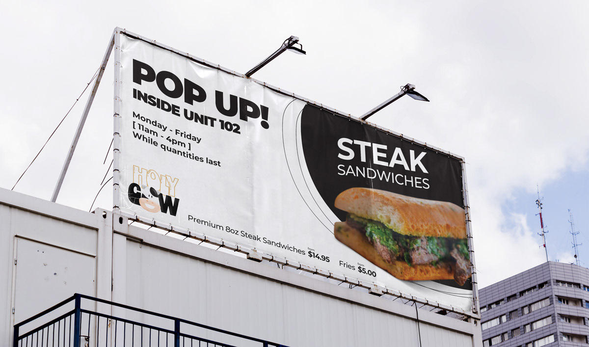
Client: Holy Cow
Client Overview:
HolyCow is a Canadian restaurant specializing in premium 8 oz. steak sandwiches made fresh to order. Positioned within the fast-casual dining space, the brand focuses on high-quality ingredients, bold flavors, and a refined yet approachable experience. Their goal is to redefine the classic steak sandwich, offering a product that feels both indulgent and accessible to a modern, food-conscious audience.

Even if it’s not used often, having a horizontal logo variation is important for flexibility in layouts with limited vertical space, ensuring consistent and clear branding across all applications.


Also, Having black and white versions of the logo is essential for versatility and adaptability. These versions ensure the logo remains recognizable and effective in situations where color printing isn’t possible or practical—such as fax, embossing, engraving, or single-color merchandise—maintaining strong brand presence across all mediums.

💛 If you enjoyed the design, don’t forget to hit that Appreciate button — it means a lot!
I’d love to hear your thoughts in the comments, too ✍️
I’d love to hear your thoughts in the comments, too ✍️
And hey, if you liked what you saw, feel free to follow along for more!
Thanks for taking the time to explore my concept — hope it brought a little inspiration your way ✨
Thanks for taking the time to explore my concept — hope it brought a little inspiration your way ✨