Client: VGO
Role: Sole Art Director
Scope: Brand creation → applied identity → revamp
Role: Sole Art Director
Scope: Brand creation → applied identity → revamp
2020 — Brand Creation
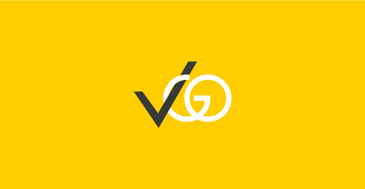
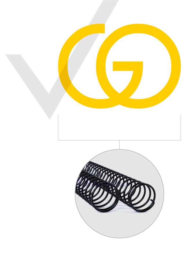
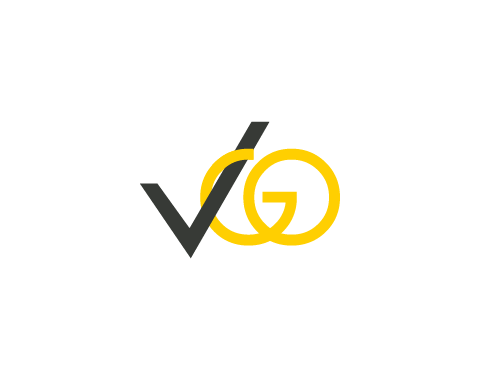
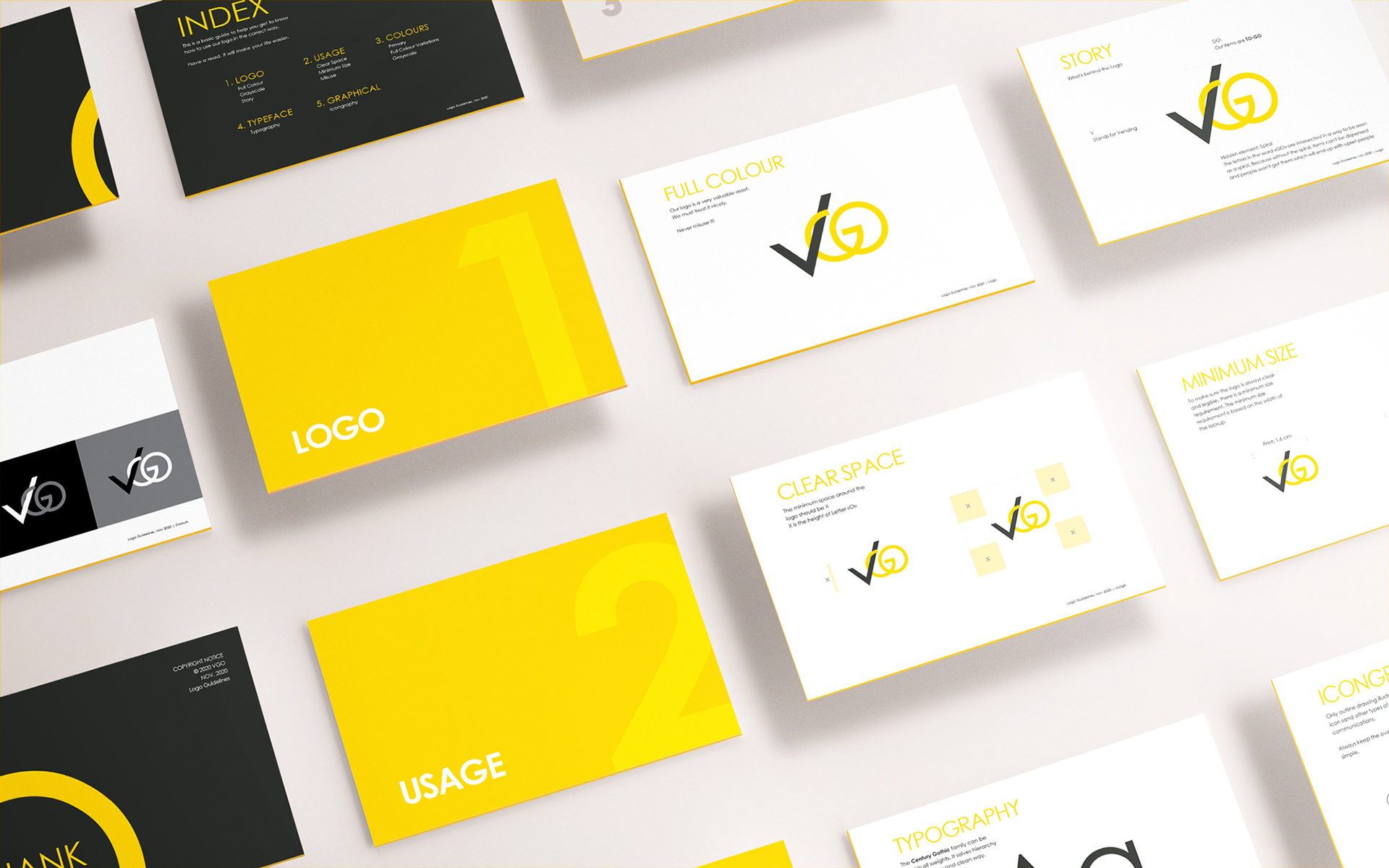
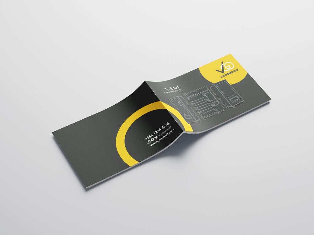
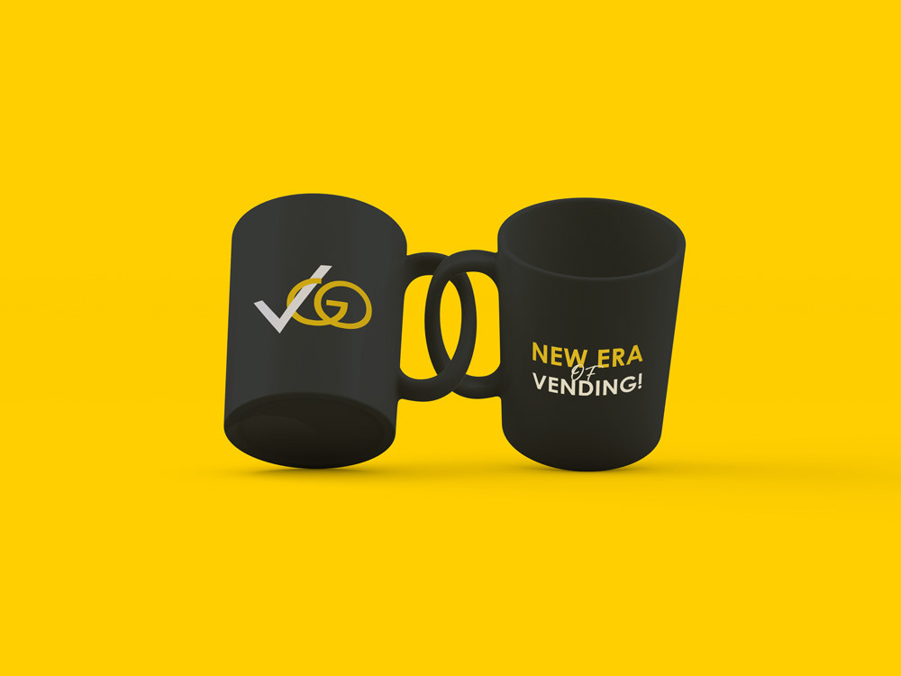
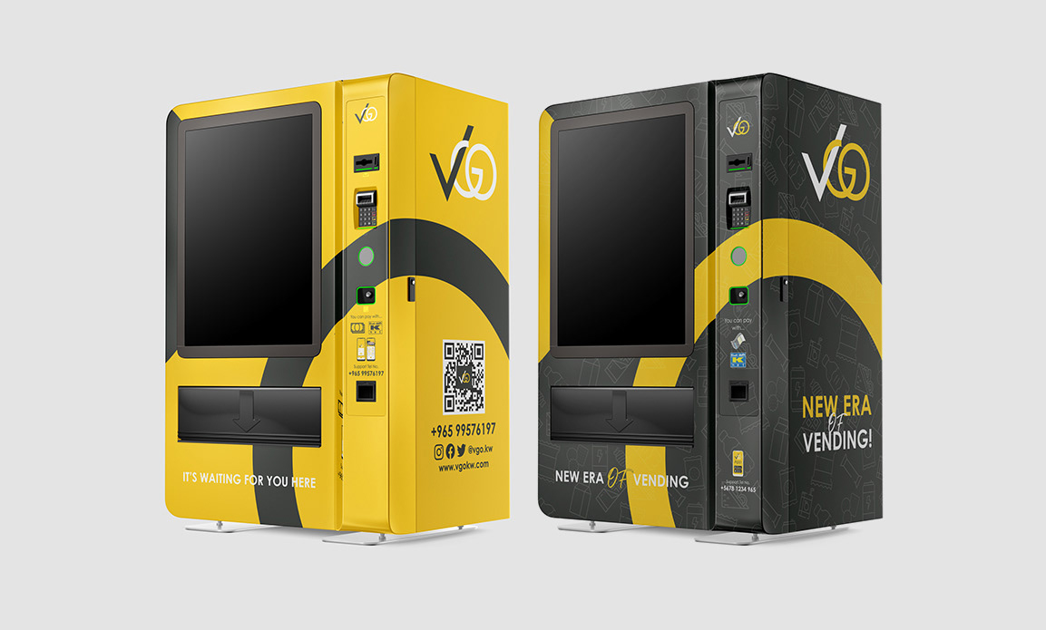
The logo elegantly centers around the word 'GO,' ingeniously intersecting its letters to create a captivating spiral. This design ingeniously captures the heart of vending machine functionality—dispensing items with precision. The spiral isn't just a visual flourish; it's the lifeline ensuring seamless service.
Without it, there's no satisfaction.
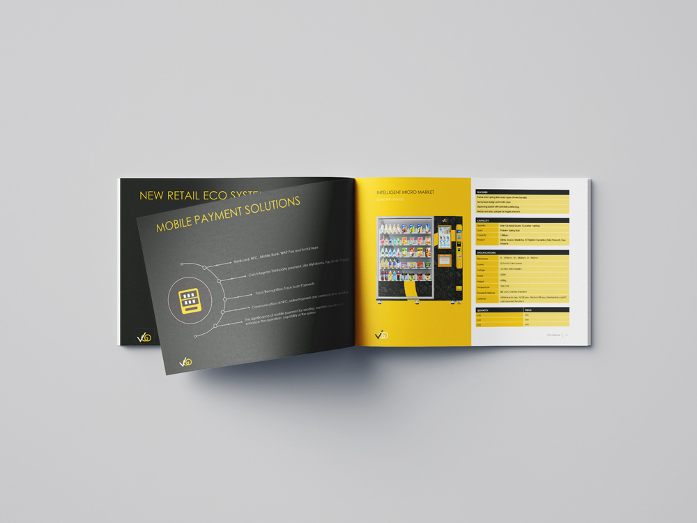
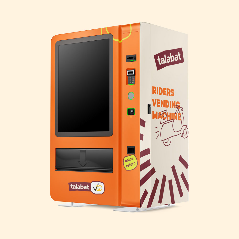
Applied Branding — Client Vending Machines
2025 — Identity Revamp
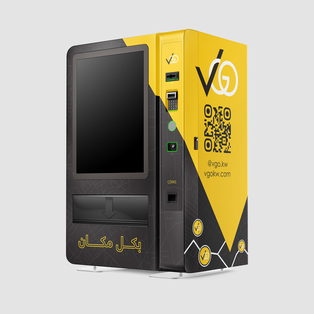

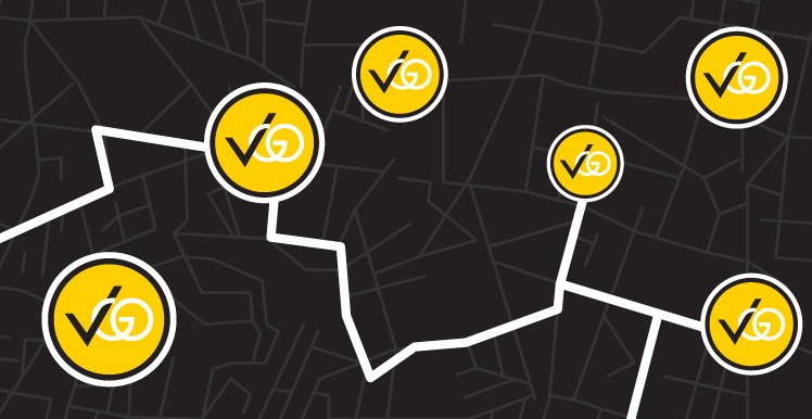
The new slogan, "Everywhere," in Arabic, was the core inspiration behind the design direction. It reflects VGO’s widespread presence across Kuwait, with machines in diverse locations and offerings—making the brand a visible part of everyday life.

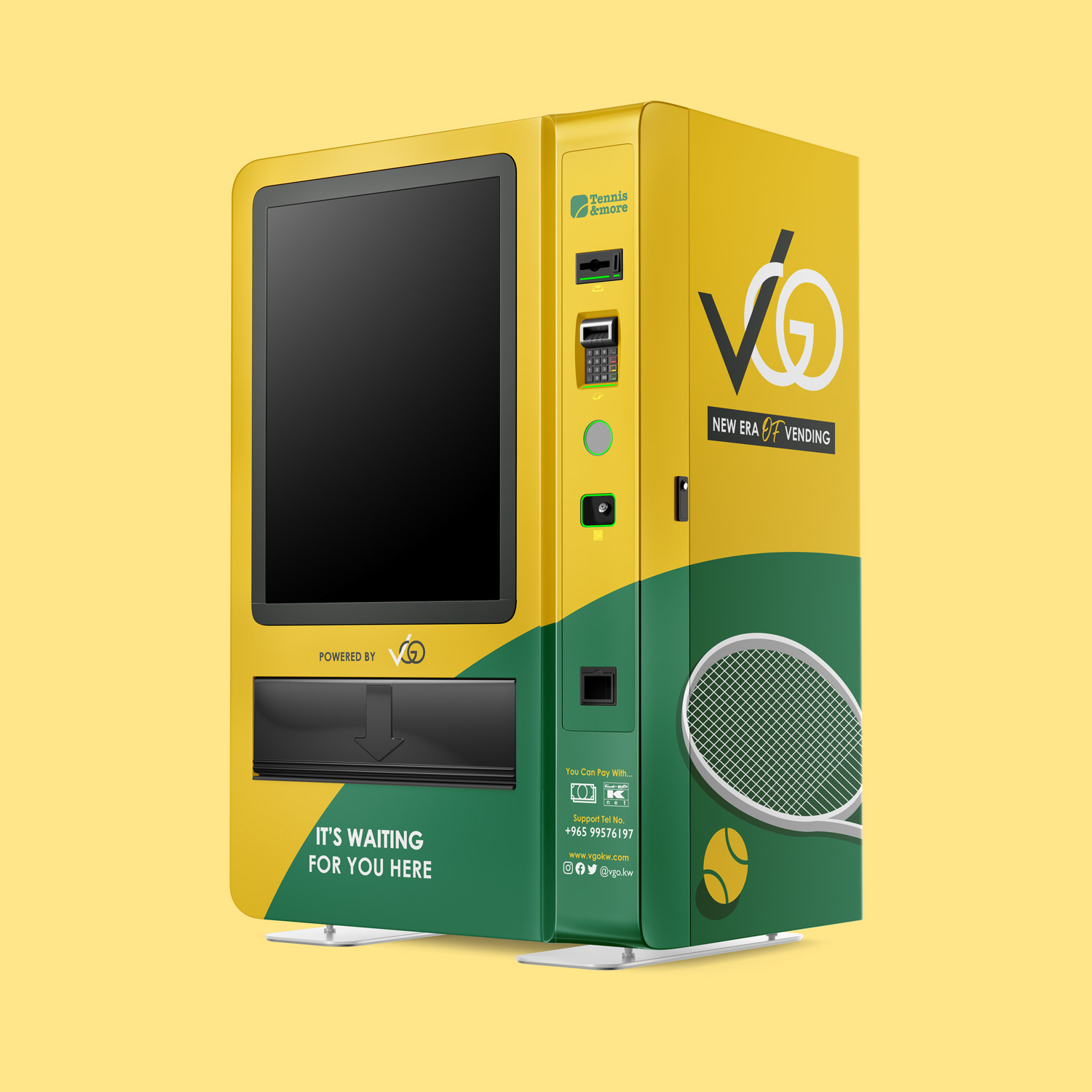
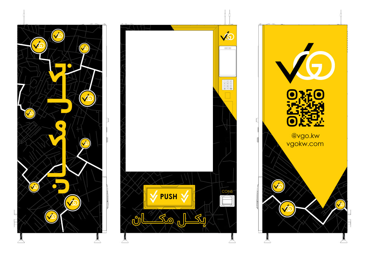
Another creative use of the logo, staying true to the brand identity, is to repurpose the "V" shape from the logo as a downward arrow. This was applied in the push area where customers pick up their orders. Such small thoughtful details matter—they enhance the overall experience and make the brand image feel complete and cohesive.
Built VGO's brand identity from scratch in 2020.
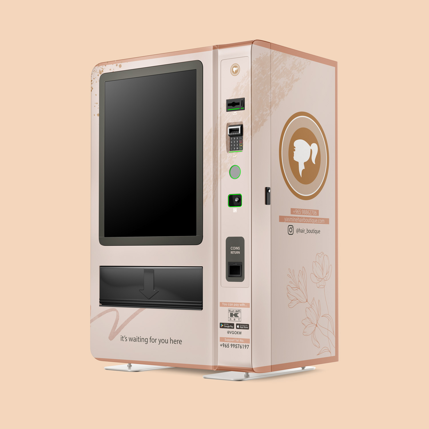
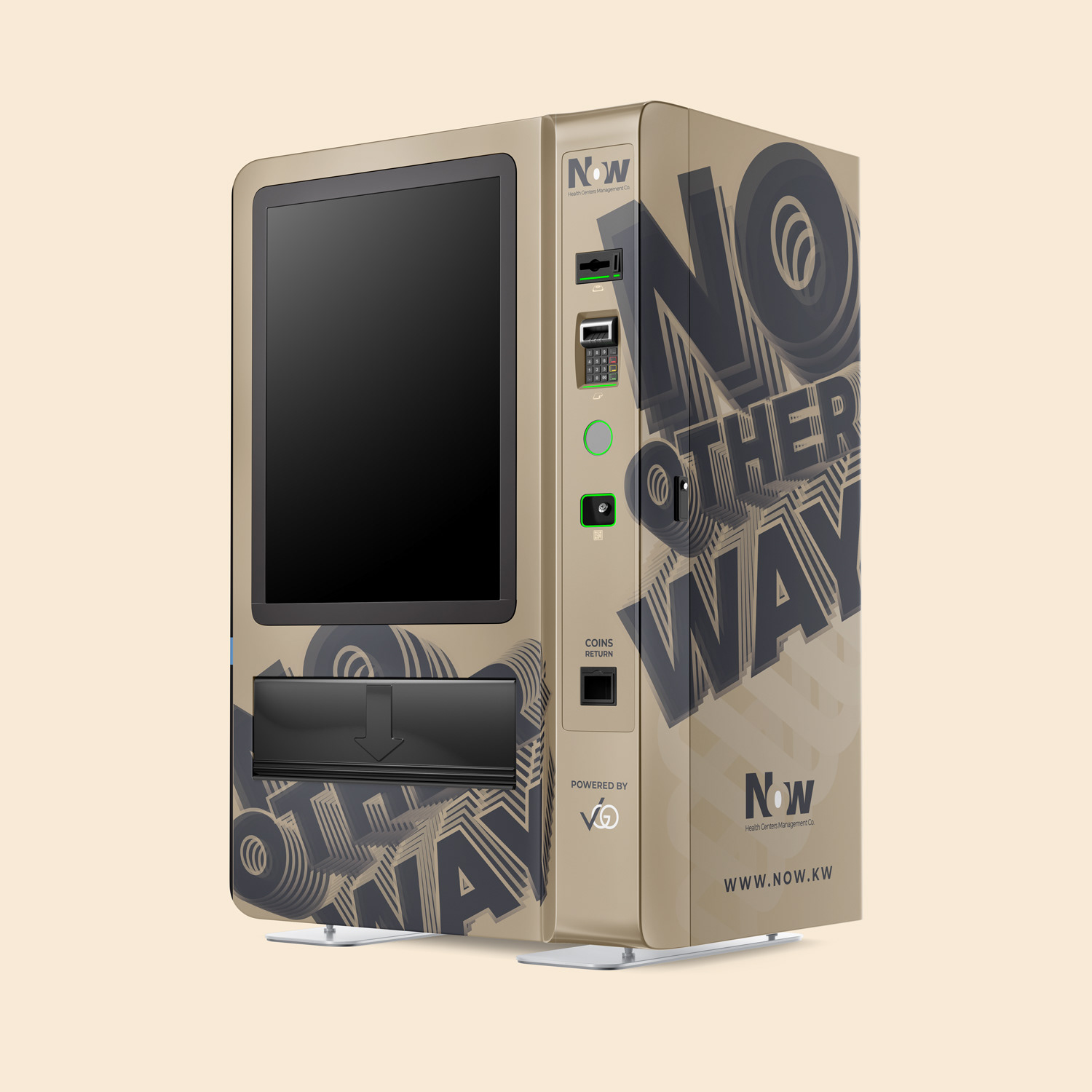
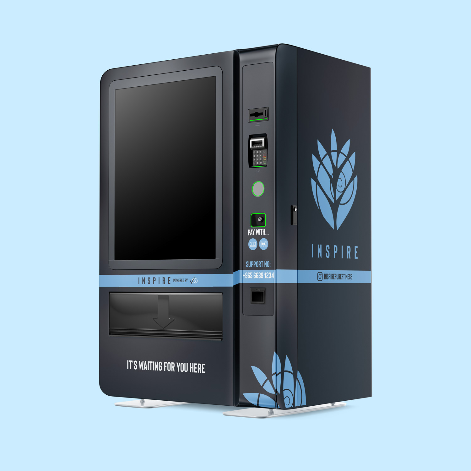
Extended that identity across their physical vending machines, and separately branded machines for VGO's own clients, working within each client's existing guidelines.
Led a full identity revamp in 2025. The partnership is still active today.